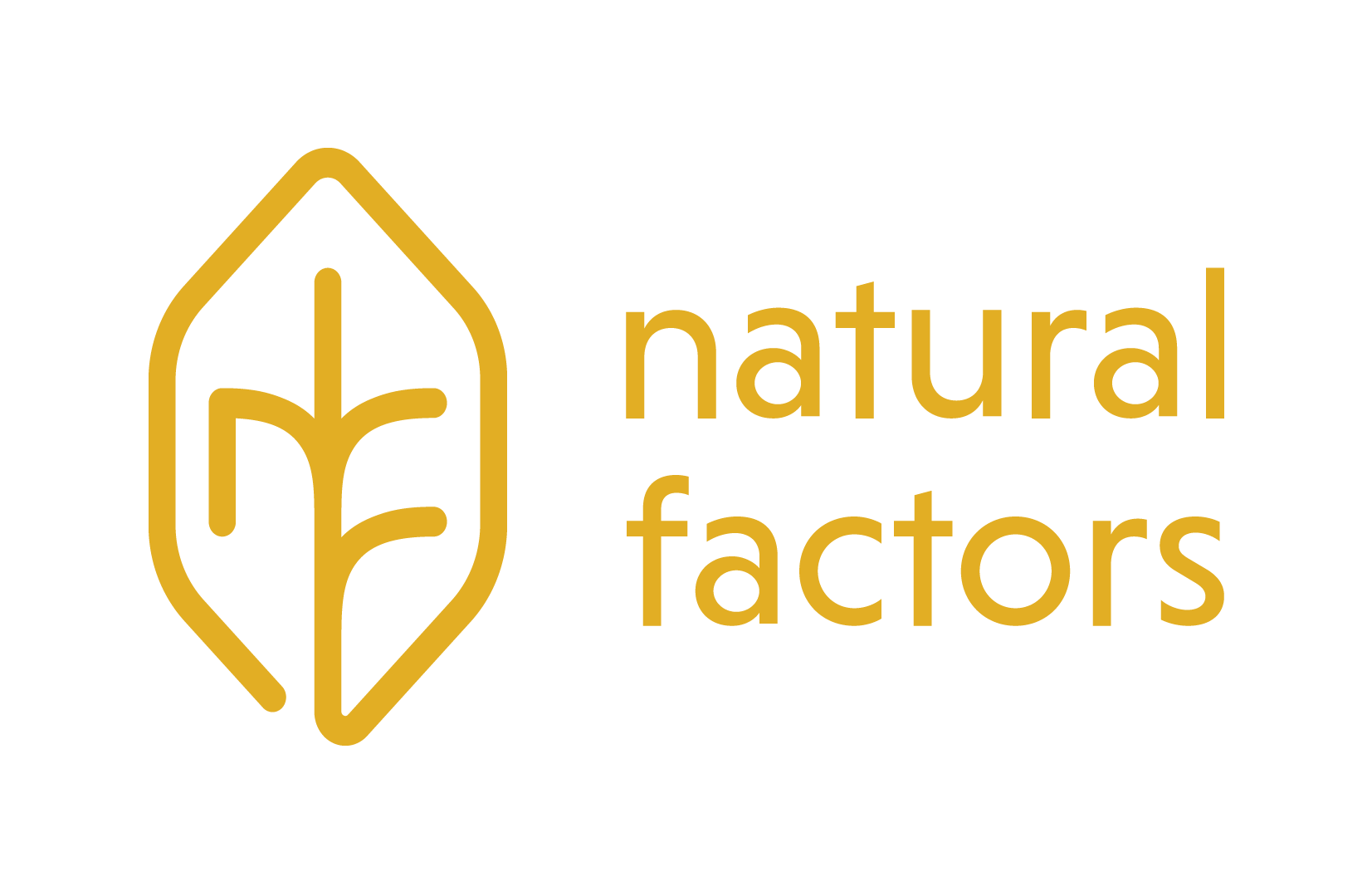
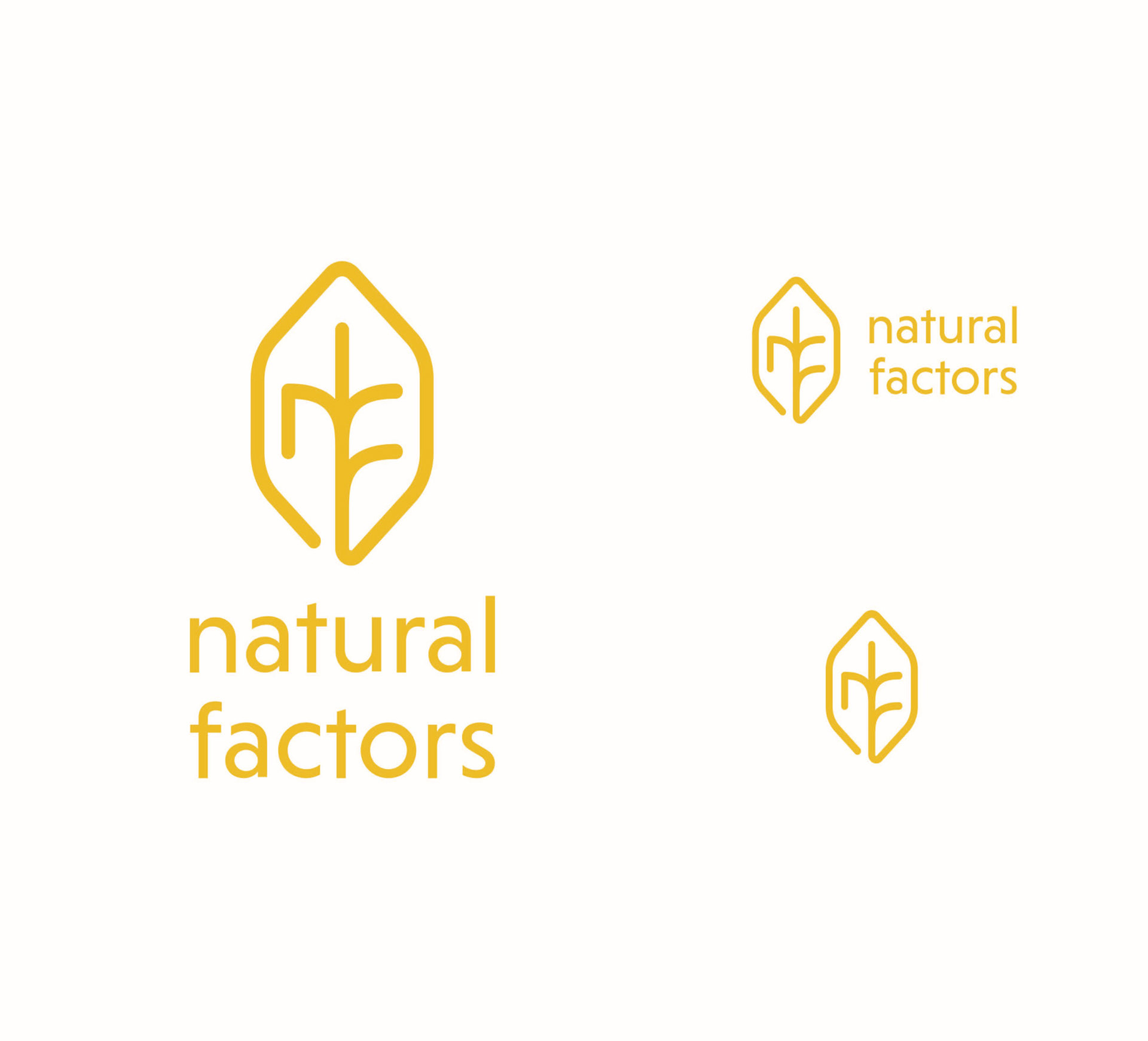
The redesign of the Natural Factors logo aims to make the company more
approachable, communicate their values, and emphasize the natural roots
of the products.
approachable, communicate their values, and emphasize the natural roots
of the products.
The goal is to blend the natural, human-centred values of the company with the sense of trust that is
needed for health-oriented products. The sans-serif lowercase typeface creates approachability, while the
subtle variations in line width and angled points add an element of humanism. Large counters and high
x-heights allow for high legibility at small sizes while still being interesting at large sizes. The consistent
shapes create structure and in entives trust. The logo icon resembles a leaf, a tree, roots, all elements of nature and growth. While using a mono line adds a feeling of modernism, the rounded terminals and corners
maintain a sense of organic shape. The use of one line to form the shape also creates a sense of movement as
well as unity.
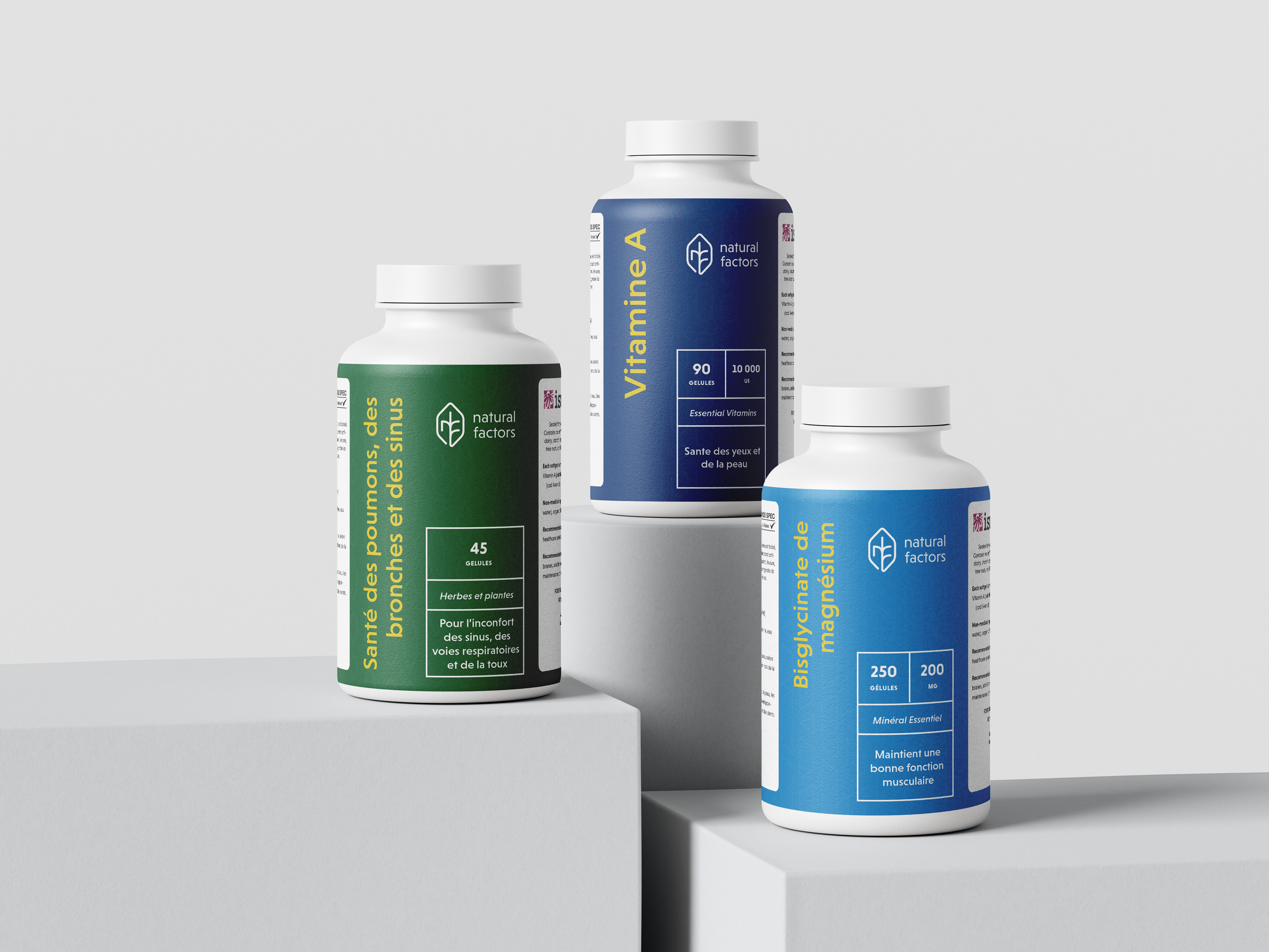
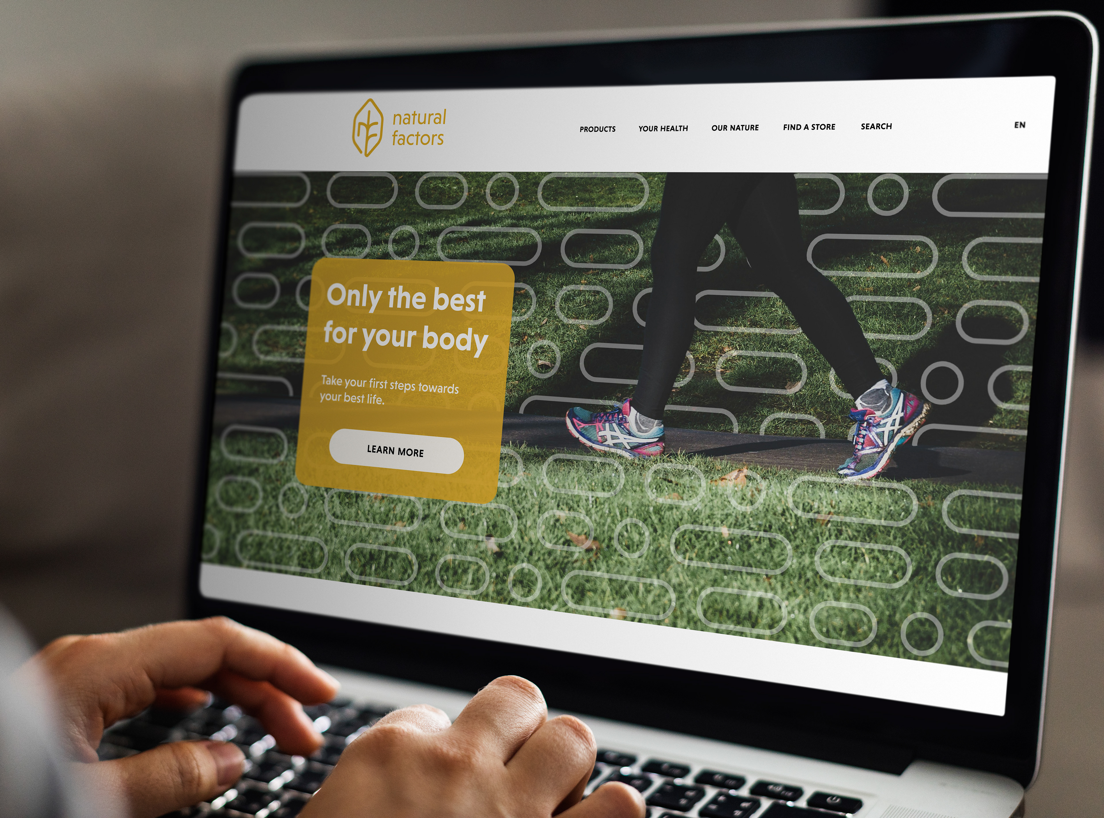
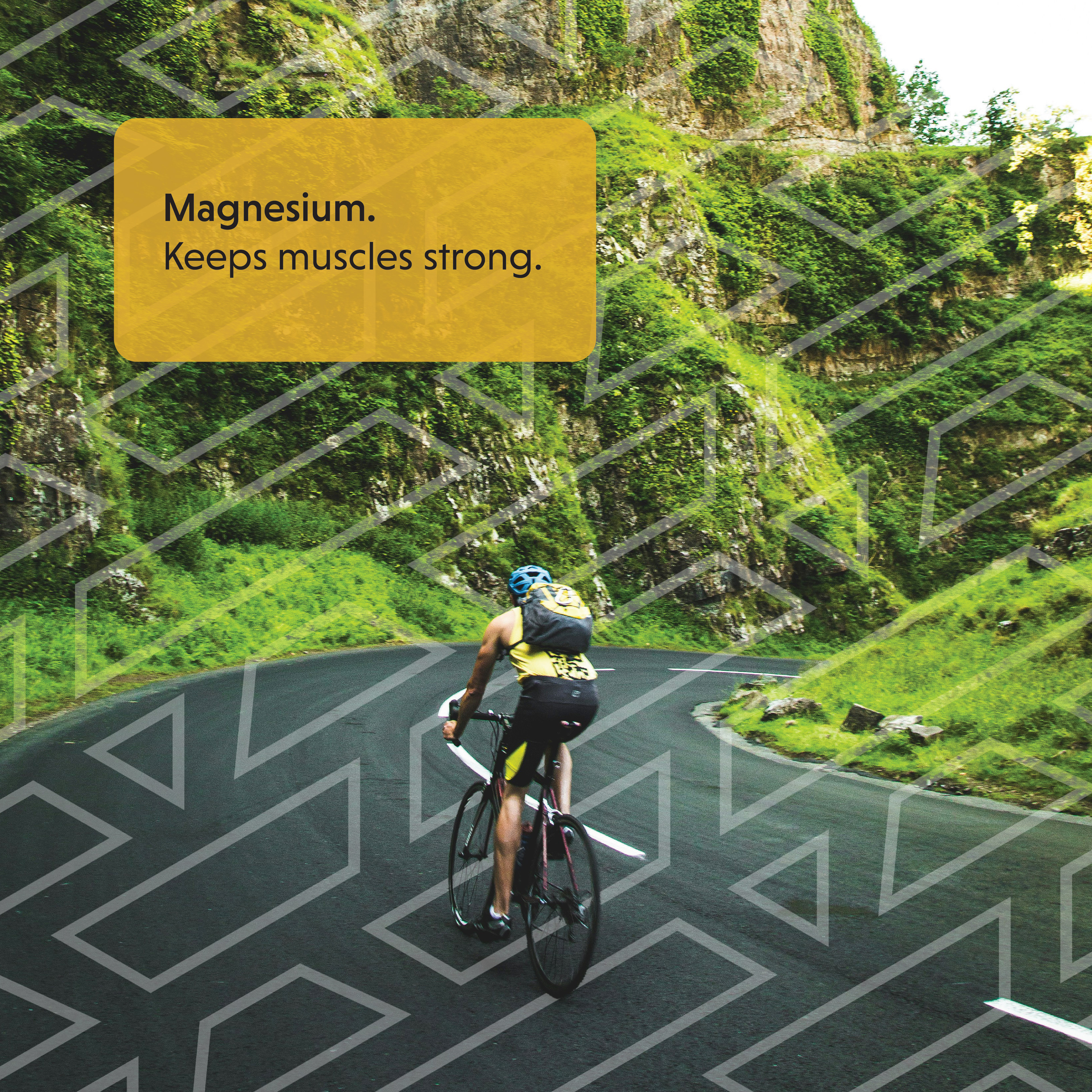
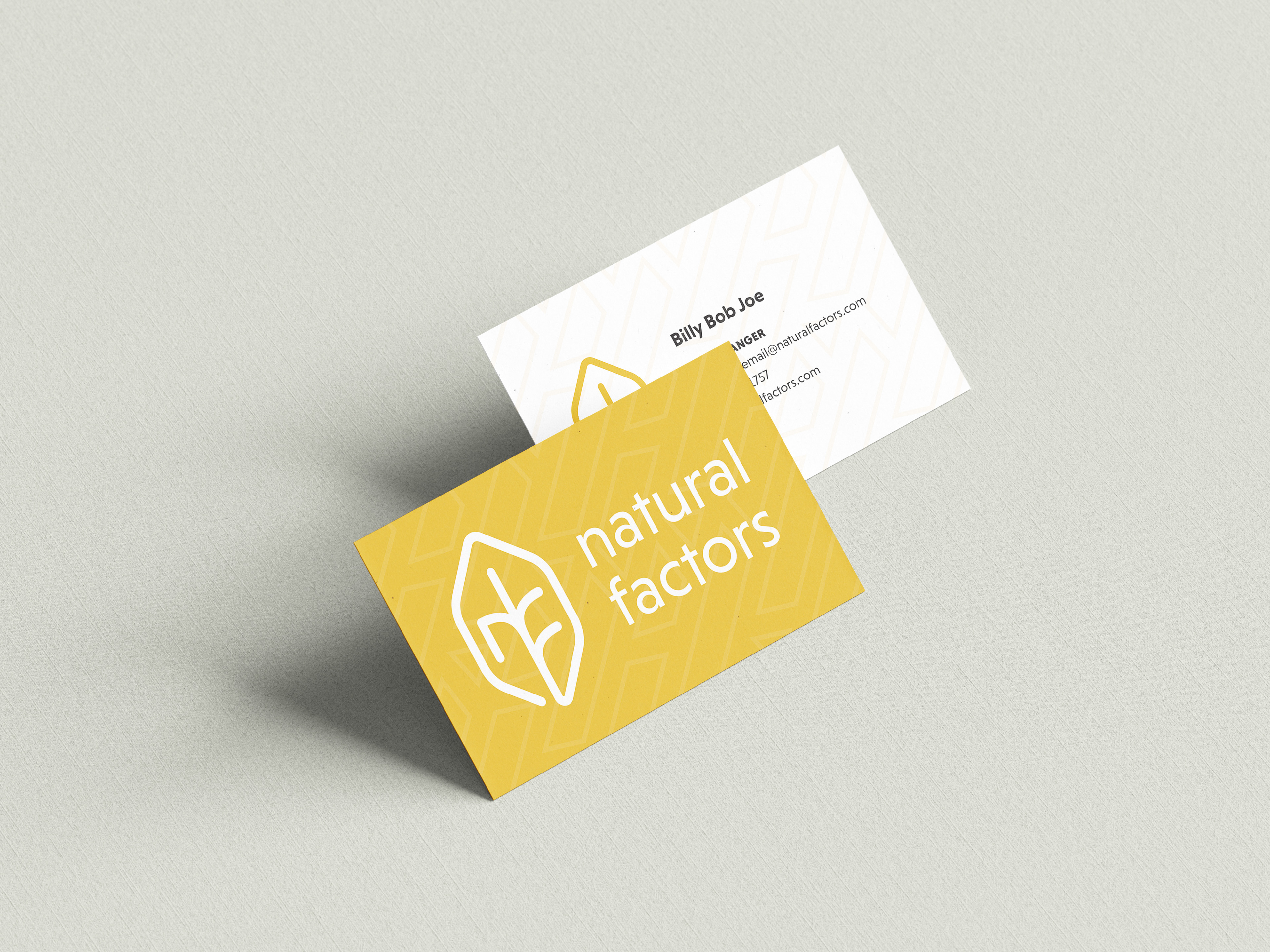
This is a conceptual brand/product.